
Lip + Cheek
CLIENT: SEPHORA USA
CREATIVE DIRECTOR: SASimon boonyavatana
SENIOR ART DIRECTOR: Olivia Meier
ART DIRECTOR: Giulia Marconi
graphic designer: Marissa newman
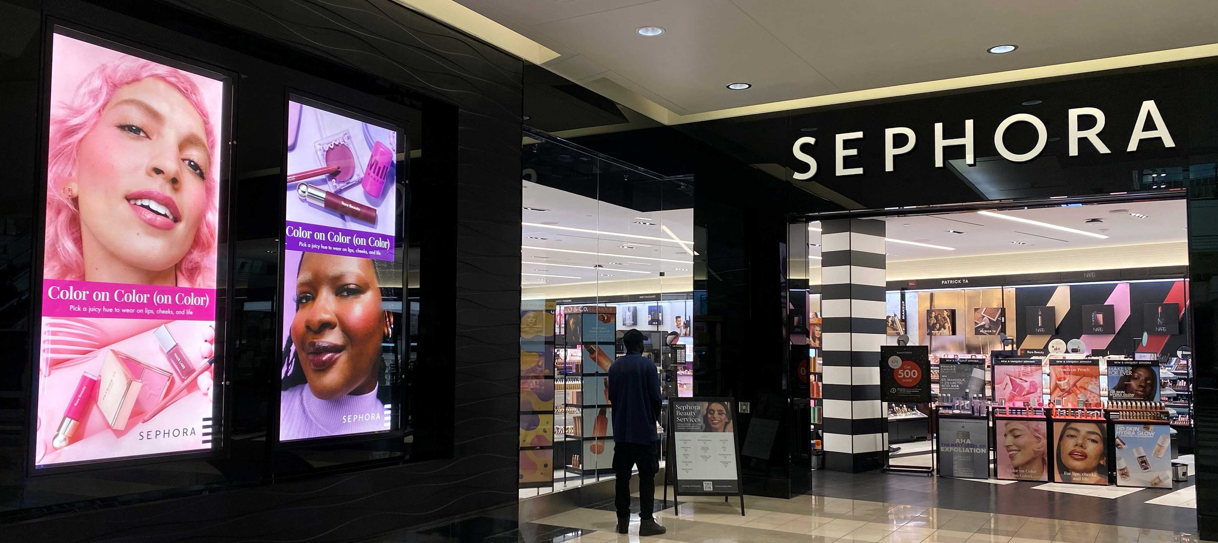
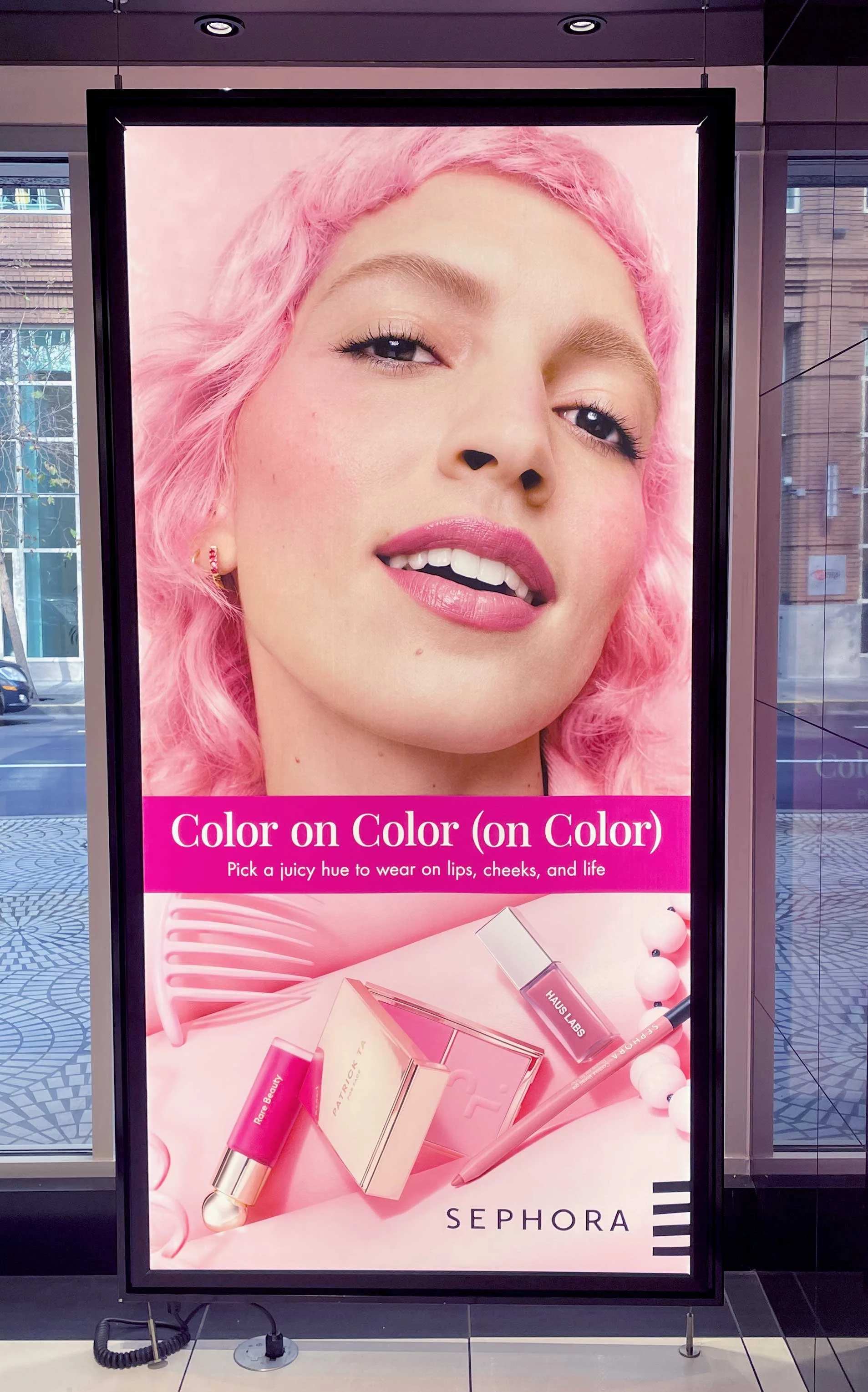
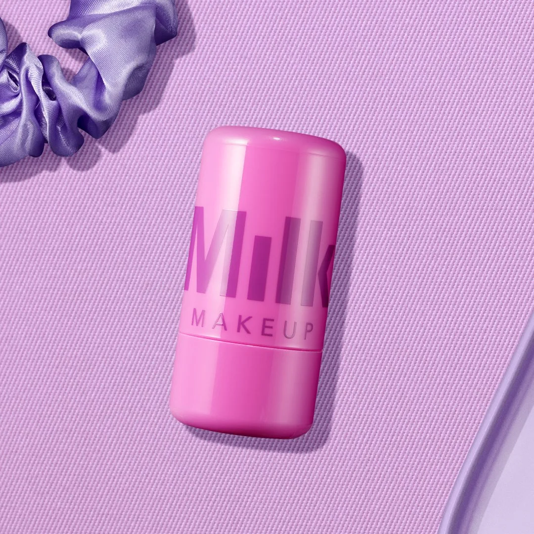
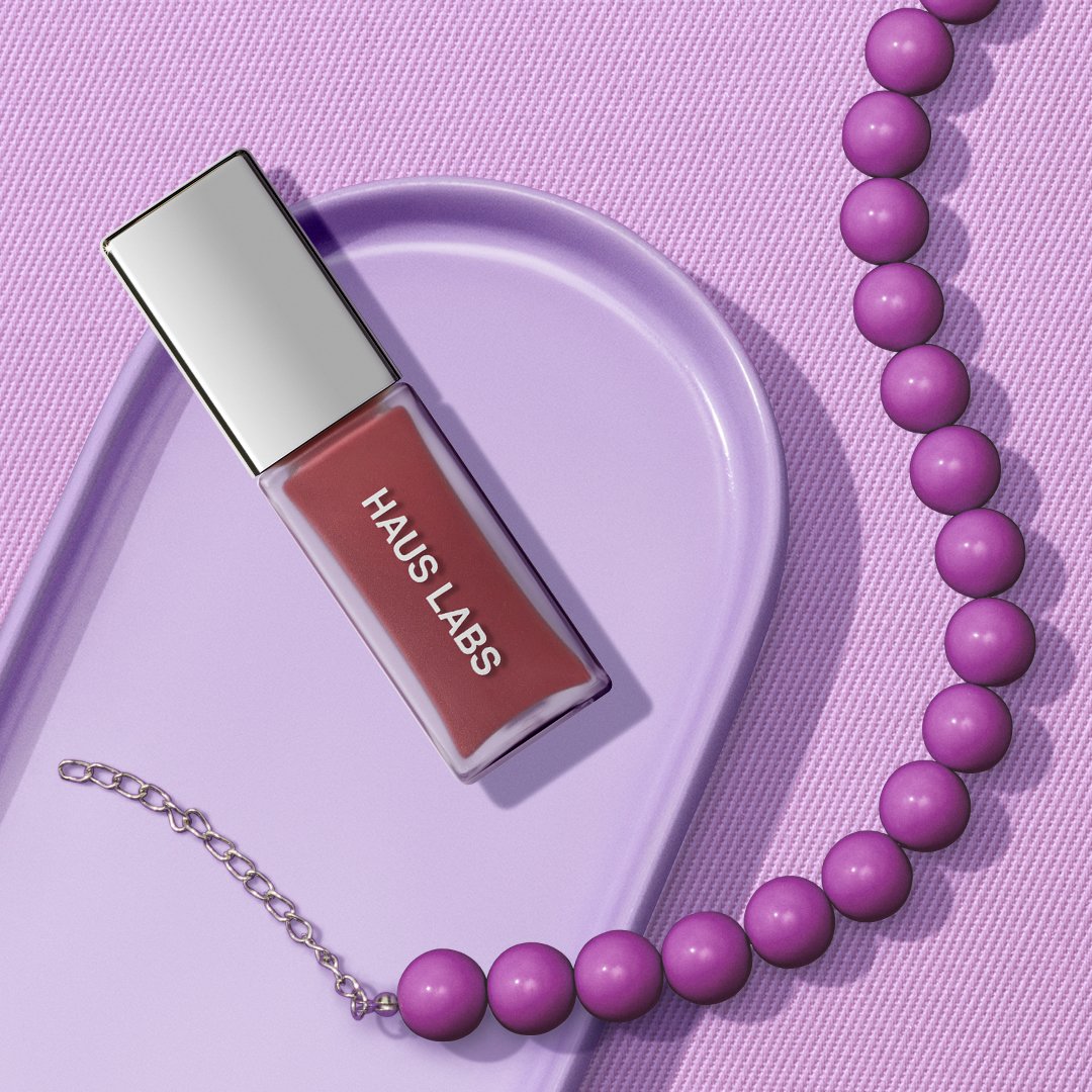
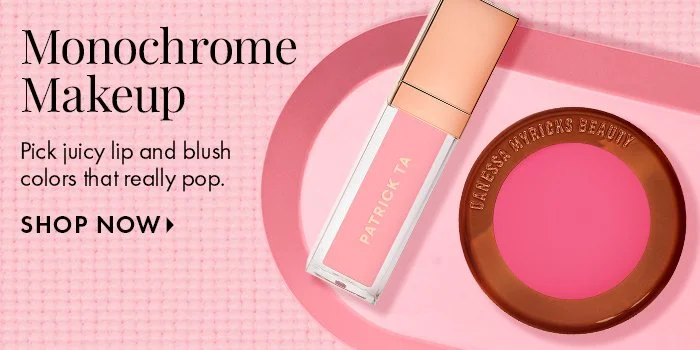
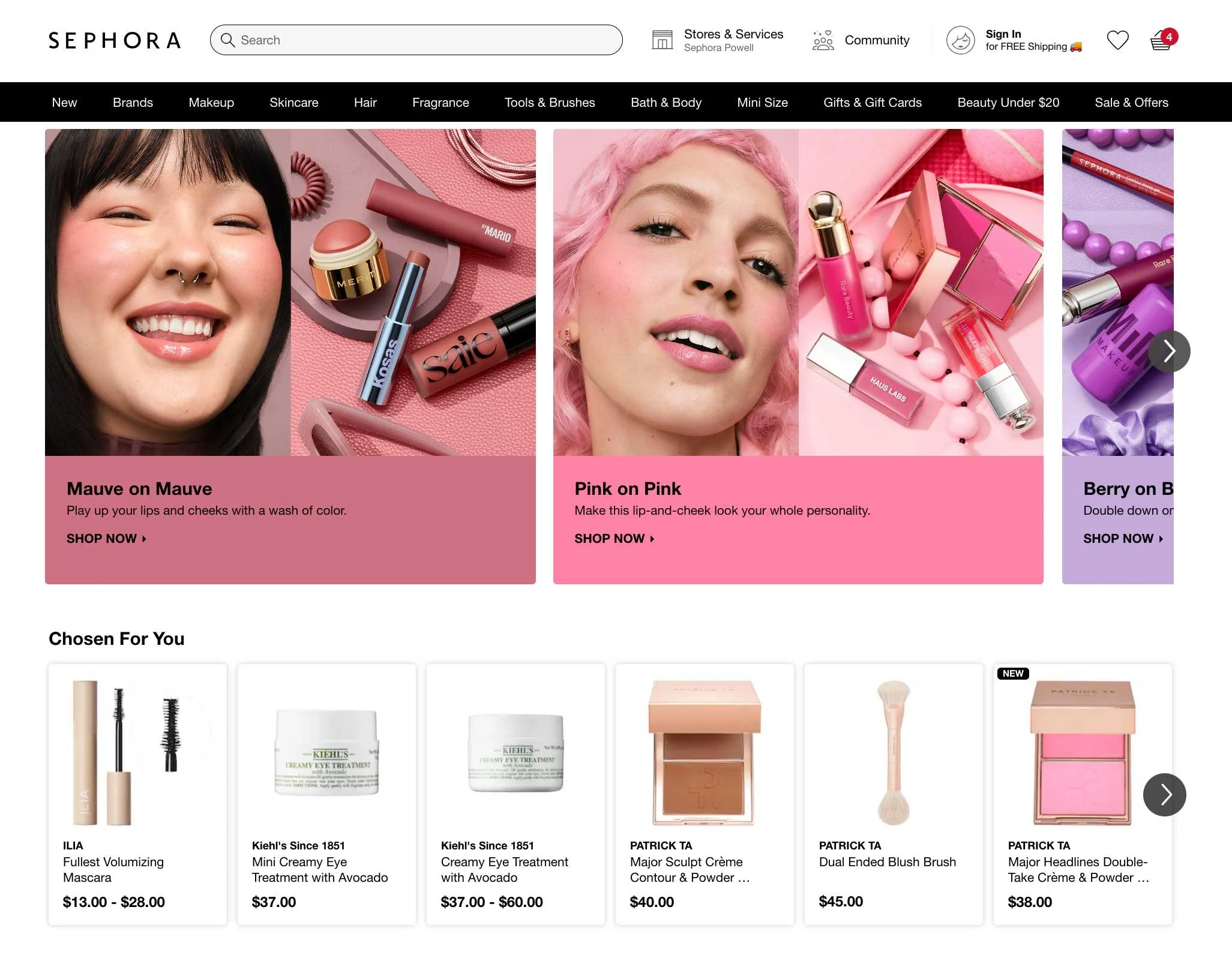
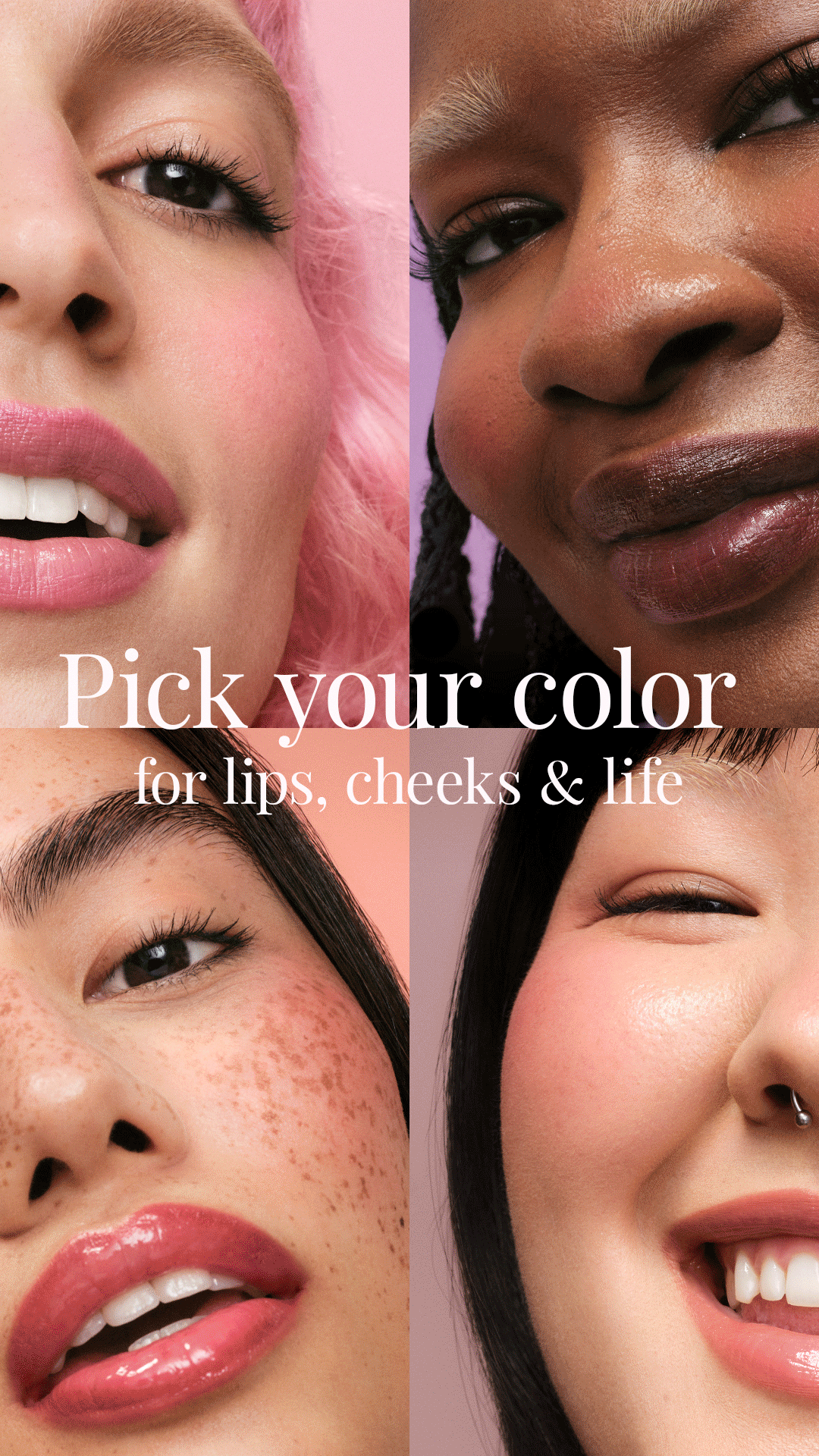
Launched in February 2024, the Monochromatic Makeup Story campaign explored the impact of single-shade styling by pairing lip and cheek products in matching hues. Featuring color stories in pink, mauve, peach, and berry-toned purple, the campaign invited clients to discover cohesive, expressive looks built around one statement shade.
Designed to resonate with new clients—especially Gen Z, the campaign embraced a daring, playful, and innovative creative direction. Each scene transported viewers into a monochromatic world, where makeup looks were extended through styling details like bags, nails, and accessories—fully immersing them in each color-way.
The visual direction combined saturated color fields, clean compositions, and tactile swatch textures to create a modern, editorial energy. The result was a campaign that showcased Sephora’s lip and cheek assortment through trend-led storytelling that felt aspirational yet attainable.
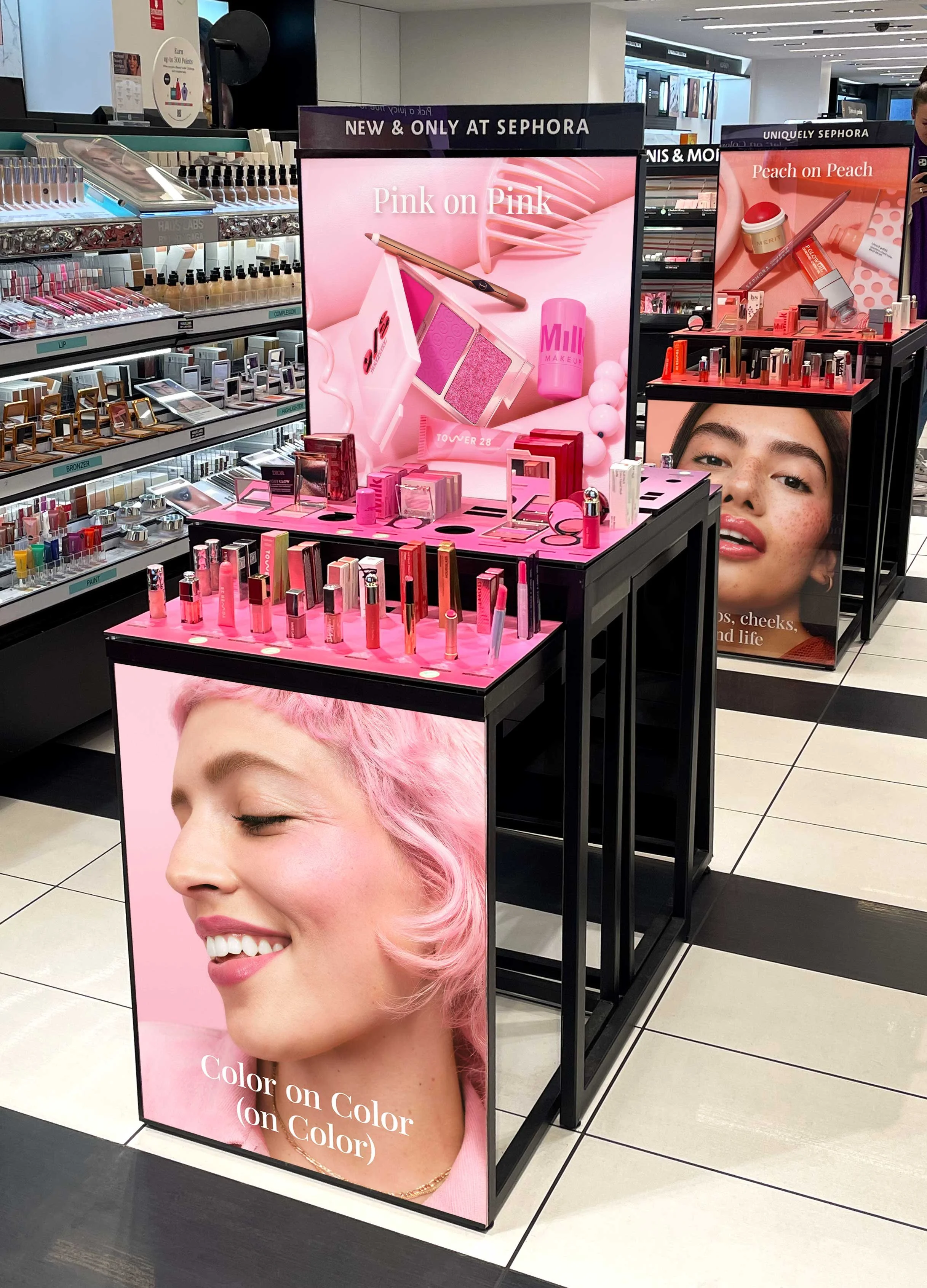
Color Matching
It was essential to build environments that felt intentional and cohesive. To achieve this, every prop, backdrop, and styling element was carefully selected to harmonize with the makeup shades featured in each scene. This approach not only unified the imagery but also introduced dimension and depth.
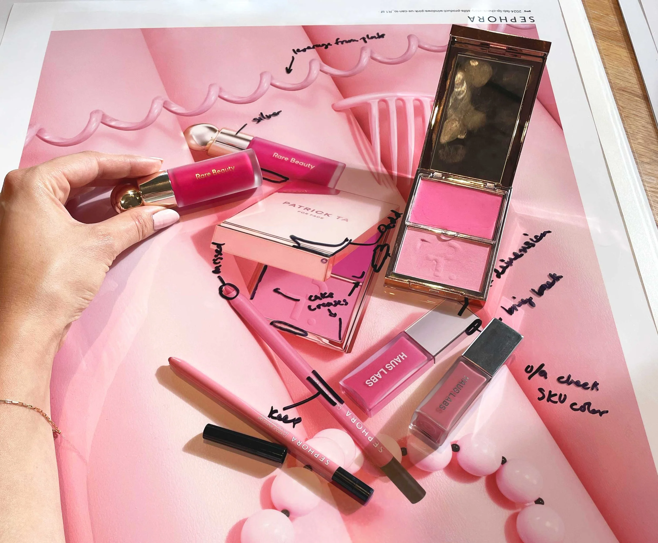
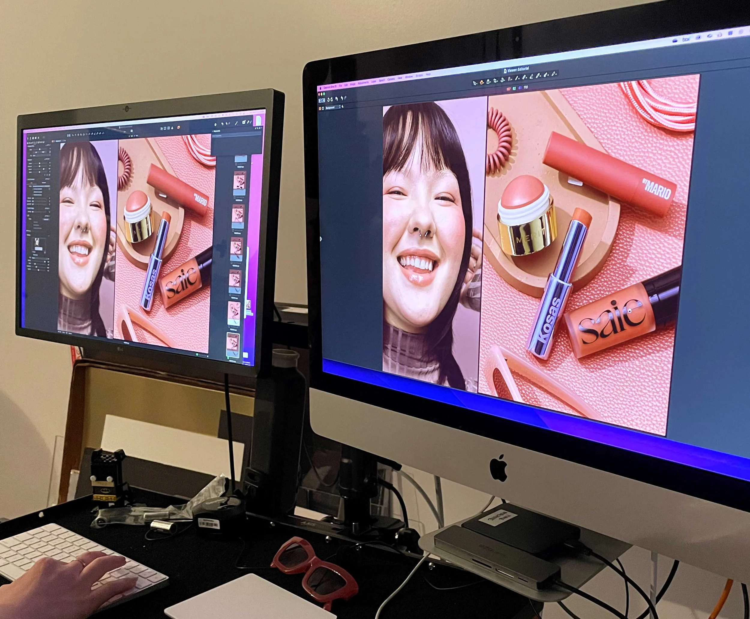
In this image, I am conducting a color accuracy check. Since color can shift under lighting or during post-production retouching, this step ensures that the final visuals accurately represent the products.
Role
For this project, I collaborated closely with the Art Director and Senior Art Director, contributing to both the creative development and production phases.
I sketched and executed window layouts and front-of-store tables, placing imagery, refining crops, integrating typography, and preparing files for handoff across global markets—including supporting French Canadian translations to ensure accuracy and brand consistency.
In post-production, I created detailed product retouching notes and performed color matching to maintain visual integrity between physical products and campaign imagery. I also assembled presentation decks for internal creative reviews, helping align the creative team, cross-functional teams, and marketing partners on key milestones and deliverables.
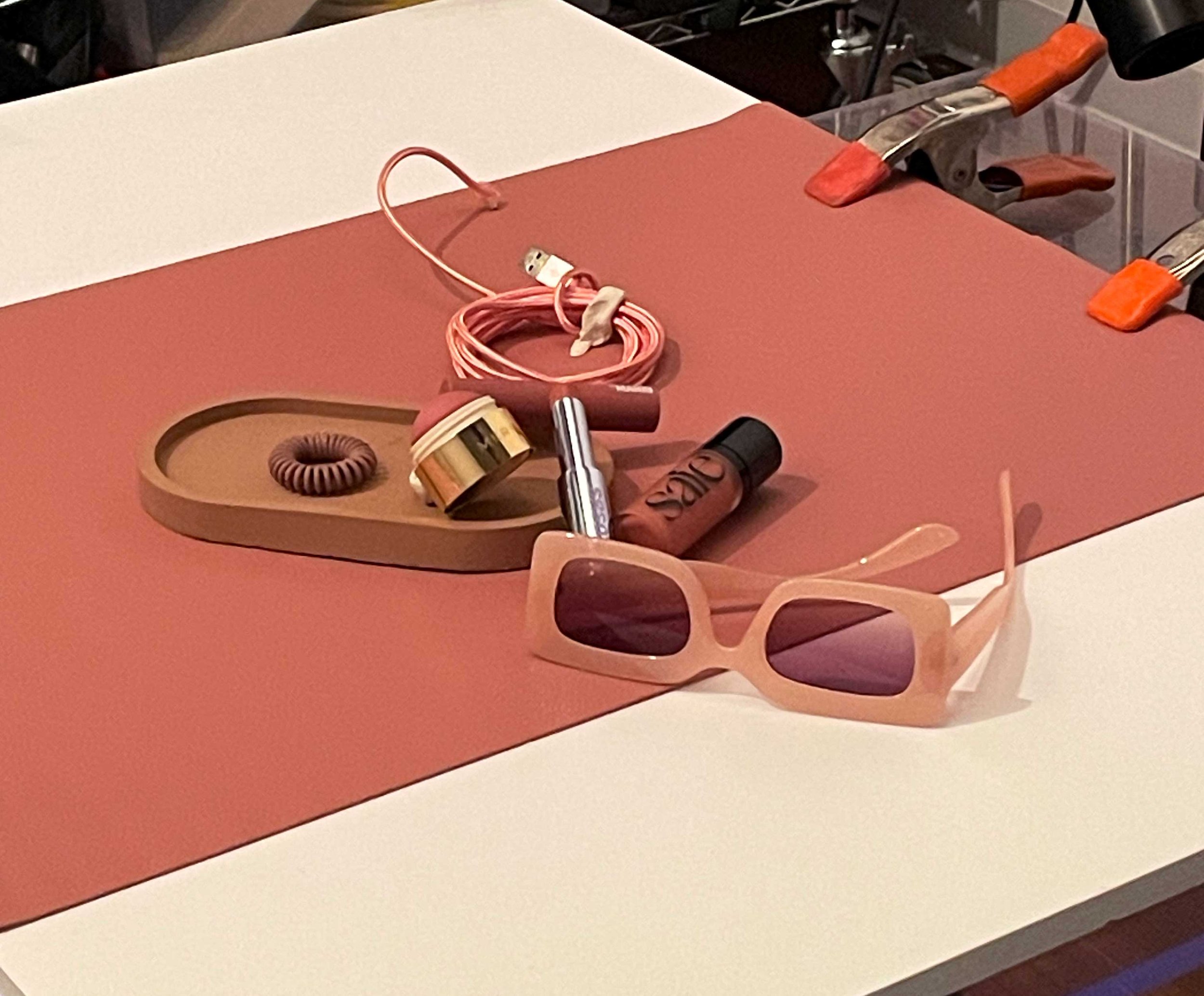
On the digital photoshoot, I worked alongside our internal photographer, Rob Prideaux, and the stylist to guide the mauve and pink colorways, selecting props and refining compositions to maintain a cohesive monochromatic story. This internal photoshoot needed to mimic and complement what was previously shot with models earlier in LA. We also captured a series of prop plates on set, which were later used to build out digital assets such as Instagram posts, emails, and website banners.
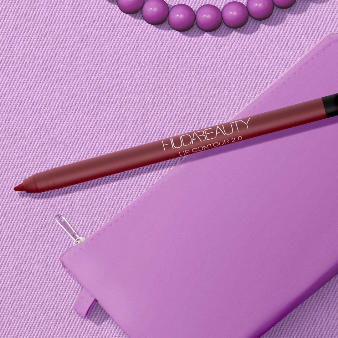
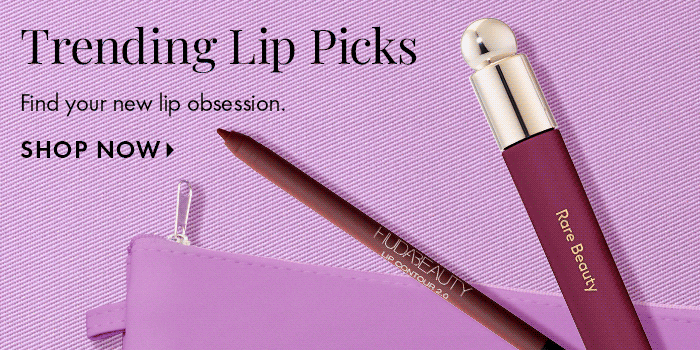
Instagram Carousel in Berry with seamless transitions created with SKU and shot prop plates
Digital Ad - 970 x 250
Email Banner
Email Banner

Hero Banners on Product Page
RWD Hero Banners
Interactive Instagram Story
“Marissa is fearless! Whenever a challenge appears, she’s always eager to assist in any way she can, even if it’s something she hasn’t worked on before.”